Tuesday, August 31, 2010

United European League

Following the same line of thought as presented in the previous post, I implemented the formula on each team's defense and offense. In the case of offense I just reversed the order of standings so that, for example, goal from Chelsea carries 1 point for that team's defense ( negative points ), but goal against Chelsea carries 20 points for offense since Chelsea equally well defends their goal as they tear up the net on opponent’s. As season proceeds I'll add other leagues. So far England and France, separate and combo. I wonder how the combo table will look at season's end?
Data from http://www.leagueday.com/. I've used form table for calculations, not regular table ( although they are same now, they will differ over time ).


Goalkeepers of England

It's time. After three weeks of Premier League soccer there is enough data to start with goalkeepers ranking as promised. According to formula, current ranking looks like this:


Friday, August 20, 2010

Premier and Primera 2009/10

Links for Google docs. Some stats are simplified, for practical reasons and are different than previously published but not by much. Correlations still hold. Everything is explained in the comments on top of the columns. Download and play. Previous seasons are coming, though further you go into the past, data becomes more and more doubtful.

Source, as always, ESPNsoccernet

EPL        and        Primera

Tuesday, August 17, 2010

Shearer and Wright

This time strikers. No special introduction needed.  


A little better team winning percentage and point rate for Wright because he played a few years on both ends of his career on lower competition level teams. Shearer, on the other hand, has advantage in career grade, win shares and relative value percentage ( average = 100 ). 
Wright had a late start of his career but his years as a Gunner were memorable. Shearer participated in Blackburn's historic run and greatness of Kevin Keegan's Newcastle United. These teams, along with Liverpool's youth movement ( McManaman, Fowler ) and post-Cantona-incident Manchester United were prolific, fast and extremely fun to watch.

Their careers according to age. Significant head start for Shearer.


Sunday, August 15, 2010

Zizu and Becks

Time to start with comparisons now that I have the tools. I've decided to start with Pele's or FIFA's list since it is as good starting point as any.

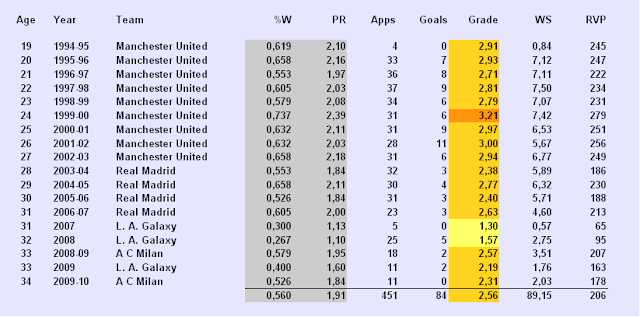
Each table will contain some obvious items: Goals, Appearances, Age and Team or teams for which player suited up that year.
Percentage of wins is one of two team statistics and refers to a percent of the games team won that season. Other team stat is Points rate or how much points, on average, team gained per game ( 0 – 3 ).
I'm using these two stats to describe the relative strength / weakness of a team for that particular season so that player's performance numbers wouldn't be out of context.

Individual stats are: Grade ( there's a heat chart for help ) tweaked a little to fit everyone equally, Win Shares ( number of points per season that player earned ) and RVP ( ReV ) or player's relative value for that season compared to his peers, in percents, where 100 is average performance.
Below the line are the career numbers or up to date achievements.
Let's roll.


And totally random soccer player only for the sake of establishing the base line:


Actually I was quite surprised to see that Becks is better than Zizu was. But blame it on the luck, late serious career start and early retirement. And don't forget that Zizu did it in the span of, really only ten years. 
Notice also the span in teams statistics for these three guys. Almost the same between them.
Teams for which Beckham played were roughly 10 % better at winning and 0,3 points better per game than teams Zidane played ( that Galaxy gig killed the numbers ). Again, roughly the same ratio applies to ZIdane and Gibbs.
Here is what their careers look charted.


Wednesday, August 11, 2010

Last step

Last step in finalizing our new statistic is merging offense and defense numbers in some meaningful way. Simplest way is to add PPG to D, adjusted with accuracy Ac. What we get is an aggregate number AG that represents individual player's input in team's defensive performance ( through saves and goals conceded ratio ), discipline and speed ( fouls committed ) mixed with offensive contribution ( goals and assists ), all calculated on per game basis.
Now, that was a mouthful... For a single player :


That composite number AG can be a standalone index. But it's not that intuitive and comparable, right?
Next step is to calculate D and AG numbers for the entire league, calculate their average or median, which ever works better ( median ), and finally calculate deviation for each player from that average/median and express the number as percentage.

I know I've lost you by now, but if you are still with me, I promise, no more math. What have we achieved with all this ?

Now we have both intuitive and comparable WYSIWYG stat. Something like OPS in baseball. In this case, the “sea level” is at 100, both for D% and ReV ( player's defense relative to league average and player's overall, both defensive and offensive value, relative to league average ).

 You can go scuba diving ( numbers can go below 100 for sub par achievements ) or you can go free climbing like the guy above. His defensive value was 48% better than league average last season and his overall value was three times higher then your average Placeholder Jones or Warm Body Smith. As simple as that.

Hidden benefit of this stat is that it is average of anything you want to put in the calculation. If you want to improve ReV by adding , for example passing stats, it can be done without disturbing the essence .Sea level would still be at 100 and all previous comparisons would still hold. Computations can be more precise, but the value ratio and validity of comparisons between players will remain the same.  
As soon as I finish beautification process, I'll post the spreadsheets for EPL.
And now, the grand finale!
ReV can be used for historic comparisons too. I've threw few hundred numbers into a cruncher to see how ReV relates to previous methods I've used for players evaluation ( Grade ).

Well, picture speaks a thousand words.


This is encouraging. Methods are interchangeable. This means that it's possible to compare players from different eras, with different sets of data used for their evaluation, with statistically significant level of correlation.

What remains now, is to enjoy the soccer by simply watching it.  


Tuesday, August 10, 2010

Attack,attack and then again attack some more

Offense is much simpler than defense. There are only two offensive categories that we really care about. Goals and assists. First, we double the points for scoring   i.e. 2:1 ratio for goals to assists, then we divide the sum of those two with the number of games played. That gives us number of points per game. That's it. Nothing else. That's offense.  


Where PPG stands for points per game, G stands for goals, A for assists, GS for games started, SB for substitution. Substitution games are divided by 2 because of Kevin Phillips. No really, if you are successful “pinch hitter” ( shooter/scorer in this case ) in the vein of Roger Milla or Ole Gunnar Solskjaer, you have to be rewarded a little.
This statistic can be used alone, but that would be a little dry. Let's consider something else. How accurate is player's kick? Does he waste a lot of opportunities or his balls have eyes? Does he bend like Beckham?
Call it the Accuracy percentage. The SH stands for shots in general, not to be confused with shots on goal.


To demonstrate; selected few from last season EPL :


Can you spot two defensive players in there?

Ac is written in American style percentage format. Drogba's 0,219 translates to 21,9 %  shooting precision. PPG is what it looks like. Drogba again; 2,159 translates in 1 goal or 2 assists per game for the 2009/10 season. Scary.

Data from ESPNsoccernet


Sunday, August 8, 2010

Defense

Before I begin I'll say a few words about the state of soccer statistics today.

Not long ago we didn't have any. Today we have it in amounts that are overwhelming. Just visit FIFA's World Cup page.
We are beginning to hoard more and more data. These are all valid data but fragmentation is great problem for grasping the big picture. There are some indexes that can help, like Castrol Index and alike but the problem with them is that they are not intuitive. For example, Frank Lampard has 776 index points for last season on the official EPL site. On Castrol he has 845 and is 4th in his league.
Meaning? 
What is the lowest possible number? What is the highest possible number? Can the values be negative...? Questions that can not be answered off-hand.
Higher is better but in comparison to what “natural” measure ( percentage, scale with upper and lower limit, some zero point...)? 
You get the picture. Not very intuitive. So, read the raw data instead, some might say...
Too much data can have the same effect. We still remain clueless. Example, until this World Cup we never had passing data in our statistic sheets, at least in Europe we didn't. Now?
As I said, FIFA's stat page. Dive in.

Enough rambling. My attempt with win shares and points is little more intuitive but emanate from a small set of data. For the historic purposes it's OK. For the future, why not use everything that we can? But since this enterprise of ours have for target audience a common fan, my aims for synthetic soccer statistics I'm developing are for them to be:

                                                                        Intuitive  and  Comparable


On the foundation of previous post about saves, I'll try to build a gauge that can capture the soccer defense.
If we add the number of saves to goals conceded during the season, we come up with the number of times the defense collapsed and allowed the opposing strikers to take their shots. Obviously, the lower number of collapses equals better defense. Until I come up with the better name, let's call it the average number of negative events per game. Catchy, right? Here is the table for last EPL season:


Or like this; strength of defenses in England’s Premier League for 2009/10 season


One other thing that indicate better defense is lower average number of fouls committed. Roughly speaking, in the case of EPL ,teams in lower part of the above graph tends to commit larger number of fouls, since their defenses are slower in reacting and positioning. There are exceptions of course, some teams have that style of play, some teams have better goalkeepers, other teams gave up trying, hence the lower number of fouls then expected. But to be on top, after the smoke clears, you need to be nice to your opponents. That's why they invented the fair play to begin with.  Here is the last season order:


Finally, combo of these two rates, in my opinion, can give somewhat accurate measure to individual defensive quality. I have excluded cards and penalty kicks since they are rare and dependent on circumstances.
On the other hand, over the span of a season we accumulate enough numbers for saves, goals and fouls to give us some level of certainty in trends that we observe.
And here is the formula; D stands for defense, FC/G for individual foul rate per game, N/G ( or NEG/G,  the program for writing formulas has an issue with NEG so I can not write it in the formula, but you'll understand it anyway ) team's sum of saves and goals conceded per game. Other mathematical operations are for cosmetic purposes only. Calculated like this, D number looks like a percent, goes upwards to indicate better performance and irons the wrinkles that occur in the cases of small sample size.


Math can be scary so let's visualize. Here are some gentlemen from EPL' s last season in no particular order ( median, on the bottom of the table, in this case works better than the average because of the big gap between the elite and average teams ); reds are below the league median:


Enough for today. That's defense. Next time offense. Data, as always, from ESPNsoccernet.

Saves and Goals

After a long summer break I'm back. Since the soccer seasons are about to start in Europe, it's time to get back to stats. For upcoming season I'll follow a few new stats that I came up with this summer. We'll start with goalkeepers. Along with the stats I've explained here ( and from now on it will be updated weekly, so the current forms of opponents will be taken in consideration; thank you Howard ),I'll monitor saves to goals ratio. It's simple enough statistic; just divide saves with goals conceded. And to give you the coordinates: higher the rate, the better. Here are the standings for EPL 2009/10; GS stands for games started, SV for saves and GC for goals conceded. Rate numbers in bold are starters numbers and they are colored, as you can guess, in traffic light fashion (data from ESPNSoccernet ):


Or like this, just starters: